If you enjoy uniforms and jerseys, there is a remarkable and long established blog that you might really like called “Uni Watch – The Obsessive Study of Athletics Aesthetics”. This is the creation of Brooklyn NY based Paul Lukas, and he blogs virtually every day in frightening thorough detail about uniforms (and because Paul can do what he likes, he sometimes takes little tangents that might not be uniform-related but are almost always of interest to his readers – off the top of my head I think of a neat piece on closed bowling alleys, not exactly uniform related but great fun nonetheless).
Over the years Paul has built up a tremendously loyal readership and his readers are in many ways an extension of Paul, giving Paul eyes and ears and research capabilities far beyond what any one person could otherwise hope to accomplish. Paul and his readers are a great example of “crowd-sourcing”, a fairly new but mostly self-explanatory term. For instance, in a great example of both Paul’s uniform obsession and crowd-sourcing, Paul recently had trouble understanding why a 1950’s minor league baseball team had horizontal lines sewn across their jersey chest and pant knees, so he put the question to his crowd. Twenty four hours later he had a very detailed answer (I’ll let you look it up on Uni Watch so as not to spoil the answer) and the mystery was solved.
This may seem a bit of a mutual admiration society, but Paul was nice enough to conduct and then publish on October 20, 2010 a somewhat lengthy interview with me about Maple Leaf Productions, Heritage Sports Art and my whole uniform involvement.
The interview can be found at the Uni Watch site and I have copied the contents below. If you know me, you likely know I don’t like blowing my own horn, but the interview below helps explain how my little bag of tricks came about and I thought you might be interested.
Enough said – here’s the interview… Wherever you see “UW”, that means Uni Watch, and “SS” means yours truly.
------------------------------------------
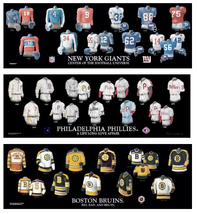
As most of you know, I recently raffled off an original illustration from Maple Leaf Productions, the company that has been selling uni-historical posters,


fridge magnets,

and other products for the past 15 years or so.
That raffle came about after I received a communiqué from Maple Leaf founder Scott Sillcox, who explained to me that he was selling off all the original artwork through a new company, Heritage Sports Art. I’d been aware of Maple Leaf’s product line but for some reason I had never thought to interview Scott or get the full Maple Leaf story. A few weeks ago we finally addressed that oversight.
Scott turned out to be a real gentleman and a great storyteller. Here’s how our chat went down.
Uni Watch: First, tell me about yourself. What’s your background, and what were you doing before you started Maple Leaf Productions?
Scott Sillcox: When I finished university in the early ’80s, I wanted to start the great Canadian magazine — sort of half Rolling Stone, half Time. But instead, through a series of connections, I ended up organizing trade shows, and I fell in love with it. Boat shows, petroleum shows, you name it. It turned out that I really love organizing things, and that’s what the trade show business is all about. By 1992, I’d started my own trade show company.
UW: And how did Maple Leaf get started?
SS: Well, you know how it is once you’re an entrepreneur. I always loved the history of sports, so I kind of morphed my trade show business into two businesses: one for trade shows and one for sports histories. In the late ’90s I decided I loved the sports history more, so I handed over the trade show business to some friends and concentrated on the licensed sports history.
UW: So you were interested in sports history, but were you always interested in uniforms?
SS: Yes. Let me tell you two stories about that. First, I was known in university as the guy who always wore hockey jerseys. I had maybe 20 jerseys from when I was a kid, and then friends would give me theirs.
UW: And this was 30 years ago, when it wasn’t so common for people to be walking around in jerseys, because merchandising hadn’t taken off like it has now.
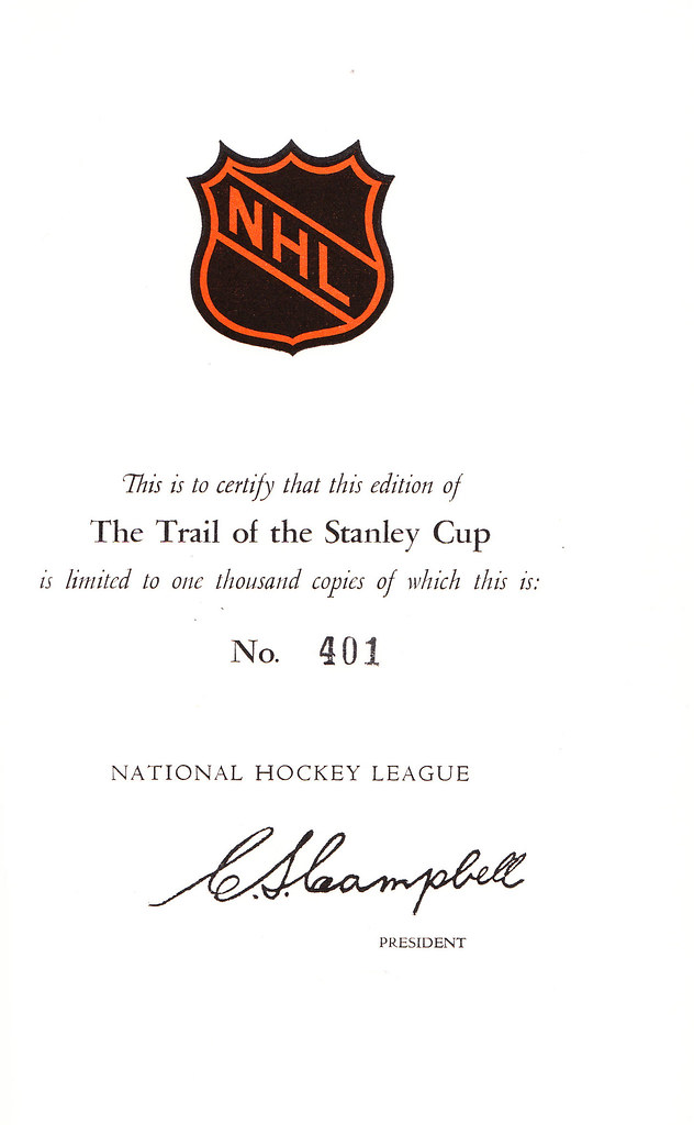
SS: Yes, it was a bit unusual at the time. But I loved them. And the second thing is that one of my grandfathers had a series of books called The Trail of the Stanley Cup.

It was a limited-edition series that the NHL published in 1966-67 to celebrate the league’s 50th season. They only printed 1000 copies of the first two volumes, and then a third volume was published about three years later, and they did 1500 copies of that one. My grandfather was lucky enough to get a set, and he gave it to me late in his life, around 1980. Anyway, the books tell the history of the teams that competed for the Cup, from 1893 up to 1967, and they included some beautiful hand-rendered uniform illustrations. Those illustrations were the inspiration for what I eventually did with Maple Leaf Productions. [Note from Scott: See my November 2010 posting entitled "The Trail of the Stanley Cup" for a much more detailed story about these books.]

UW: Oh, so your basic style of showing a jersey on a headless mannequin, that was based on the illustration templates from the book?
SS: Yes, exactly. And when the NHL first did throwback jerseys in the early ’90s, I’ve been told that they used those same renderings for the logos.
UW: Wow — I’d never seen those renderings before. In fact, I’d never heard of this book series.
SS: They’re very rare, and I’m so lucky to have a set. I often say that if the house was burning down, that’s what I’d save.
UW: So when did Maple Leaf actually get off the ground?
SS: The licensed sports part was in 1996. I had applied to the NHL licensing department for a few years prior to that. I wanted to produce a family of products, mainly posters, showing the history of uniforms, and I got turned down a couple of times. And they were probably right to turn me down — I had no experience in selling to retailers.
UW: And was the way you were envisioning and describing the project at that time very similar to how it’s turned out? In other words, lots of products showing images of old uniforms?
SS: Yes, that was very much what I had in mind. I maybe didn’t fully envision how many products the images could be put on, the basic concept of uniform history and evolution was there from the start.
UW: So what happened after they turned you down?
SS: I thought if I published a poster that didn’t need licensing, and if it was successful, that would show that I knew what I was doing. So I did a poster called “The Original Six,” showing artists’ sketches of the Original Six hockey arenas. I’d consulted with lawyers to confirm that I didn’t need a license to do that. We probably sold about 100,000 of that. So then when I went back to the NHL in ’97, they said, “Okay, you’ve got a track record, you can be a licensee.”
UW: So that was the first Maple Leaf Productions product.
SS: Yes.
UW: Did your company name lead to any problems with the Toronto Maple Leafs, or does every company in Canada just call itself Maple Leaf This or Maple Leaf That..?
SS: Once in a while I’ve heard from the Maple Leafs organization, saying, “How did you get that name?” or “We really should have that name.” But nothing ever came of that.
UW: When you started doing this, people weren’t writing and talking about uniforms as much as they are today, and the interest in throwbacks and uniform history wasn’t as great as it is today. What made you think people would be interested in images of uniforms?
SS: I just thought it could look so attractive that even if someone wasn’t already interested in uniforms, seeing a team’s uniform evolution would make them interested. I just thought a fan of a team would be interested in seeing that, even if he’d never thought much about uniforms before.
UW: So once you got the NHL license, did you immediately put out posters of all the teams, or did you start with the Original Six, or what?
SS: Yes, I started with the Original Six teams, because I thought there would be the greatest demand for those, and then I expanded to the other teams. And then the NFL and Major League Baseball came next, in 2000.
UW: Did you approach them, or did they approach you?
SS: I approached them, and they were both wonderful to work with. At the time, the NFL had about 400 licensees. Now they have only about 80. They’re much more selective now — they keep whittling it down, and fortunately I’ve always made the cut.
UW: And over the years you’ve also worked with the CFL and the NCAA, right?
SS: Yes, that’s it.
UW: How many individual teams or schools have you documented over the years?
SS: I think it’s 115.
UW: And how many individual illustrations have you published in the course of documenting those 115 teams?
SS: Roughly 1700.
UW: You’ve never worked with the NBA. Why not?
SS: The NBA used to call me every year, and I was very flattered by that, but it never worked out, for two reasons: First, I’m not an expert in basketball history. I just don’t know that much about it. And secondly, it seemed to me that basketball are a little bit more about the here and now — what’s hot, what’s new — than they are about history and the past.
UW: Part of that, I think, is because basketball is by far the worst-documented major sport in terms of its history. It’s hard for fans to connect with that heritage if the resources aren’t there for them.
SS: One time the Washington Wizards asked us to do a fan giveaway, so we did do that. But aside from that, we didn’t think there was a market for the heritage side of basketball.
UW: Let’s talk about the process of creating the artwork on your products. First, they’re watercolors, right?
SS: Yes, they’re all watercolor paintings.
UW: I know you’ve had several different artists. Did you originally have just one and then you had to expand, or did you have a rotating stable of artists right from the start?
SS: Started with one — a wonderful man named Tino Paolini, who was an art teacher in Toronto.
UW: How did you find him, or know of him?
SS: I run an adult soccer league. A recreational league. And Tino was one of the players. That’s how I got to know him.
UW: So you explained what you had in mind for Maple Leaf Productions?
SS: Yes, and he got it right away.
UW: Is he a hockey fan? I mean, here you were asking him to paint hockey uniforms.
SS: His first love is soccer. But he likes hockey and other sports very much. He’s a wonderful artist, but he took about 24 man-hours to produce a painting, which meant he couldn’t keep up with the volume of illustrations we needed. I was always encouraging him, “Tino, can you work a little bit quicker?” And he’d say, “Scott, I’ll do my best,” and then the next one would be 23 and three-quarters hours. That was just his pace. But he had a great attention to detail, so in retrospect I’m glad he didn’t succumb to the pressure I was putting on him.
UW: So because he worked at a deliberate pace, that’s why you had to bring other artists on board?
SS: Yes. Nola McConnan, who became our most prolific artist, was a family friend. She had a lot of experience painting horses — an equine artist — but she tried a few paintings for us and sort of fell in love with the male torso.
UW: Was she a sports fan?
SS: Yes. After she did about 1000 paintings, she needed a year off, which was completely understandable.
UW: Do the different artists have their own stylistic quirks? Like, does one artist tend to show more texture than another, or maybe one of them has a particular flair for jersey typography, or whatever?
SS: As much as I would love them to be indistinguishable, they have their own identifiable traits. Tino specializes in rich, detailed color — many layers of color, so that the watercolor almost looks like an oil painting. He’s extremely detailed, right down to the stitching. Nola is a little more about light and angles and wrinkles — there’s a little more life in her images, as if the jersey were on a living person instead of a mannequin. And then our third artist, Bill Band, he’s a wonderful artist with a good attention to detail, but I would have to give him very explicit instructions. His style is sort of in between Tino’s and Nola’s.
UW: How large is each original painting?
SS: Most of them are 9 by 12 inches. Some of Tino’s original NHL pieces were larger — 11 by 17.
UW: Is each painting a still-life? In other words, is the artist looking at a real uniform that was placed on a real mannequin?
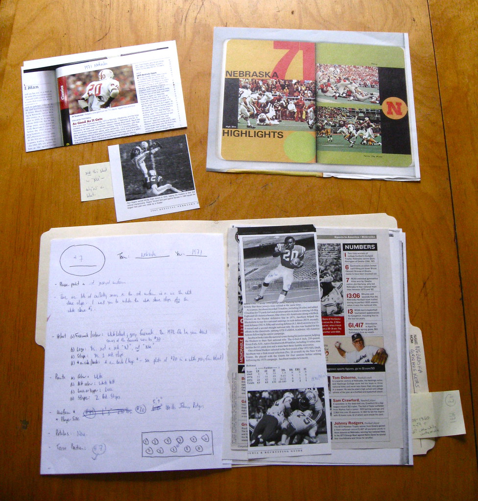
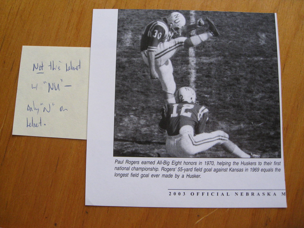
SS: No. I would give each artist a research file for the team in question. And inside the file would be 10 or 20 pieces of source material, sometimes with notes, along with a page of instructions to the artist — “Please note the double belt loops,” or whatever. [Here's another page of instructions. -- PL]
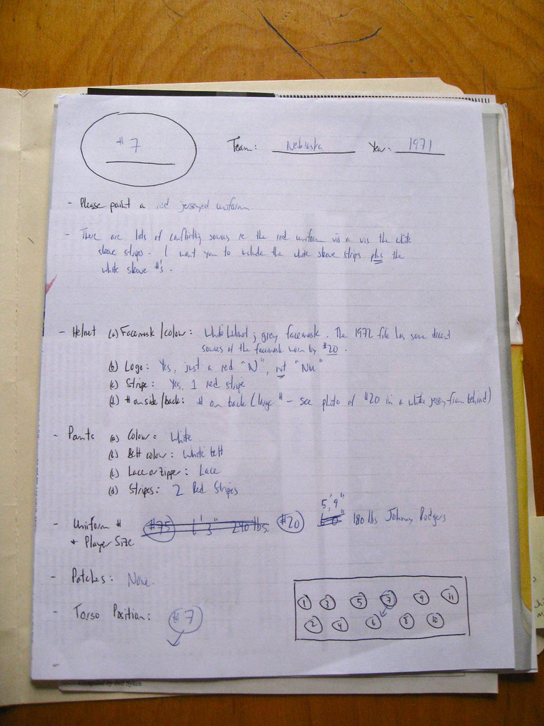
UW: What would the source material be — photos?
SS: I spent an ungodly amount of money on used books. Every football book I could buy, every baseball book I could buy, and then every team-specific book I could buy. And then I became the king of razor-blading books. And then I would augment that with many, many trips to the various halls of fame. And then there are media guides, baseball cards. Anything I could get my hands on. So I now have thousands of folders — every team, every year. And of course you learn along the way that just because a book lists a certain date, that doesn’t mean it’s accurate. I learned to discount almost any caption and to do my own confirming research.
UW: Did you approach any of the teams themselves?
SS: Unfortunately, I quickly learned that there are very few teams with a good sense of their own histories. I don’t mean to say they don’t care about their past, but they don’t tend to have a team historian or someone who’s particularly well versed in that kind of thing. About the only exception was the Chicago Bears — they were wonderful, and were willing to do anything they could to help me.
UW: Most of your old images must have been black-and-white. How could you be sure about colors?
SS: Well, I wasn’t trying to show every single year of a uniform’s evolution — just certain specific years. So if we weren’t sure about the colors a team wore in, say, 1923, we’d just show what they wore in 1924 or ’25, assuming we had good color information for one of those years.
UW: What other factors did you consider when deciding which steps in a team’s uniform evolution to include and which ones to leave out? Some teams have pretty complicated histories that you could never show in their entirety, even if you had perfect research materials documenting each step of the timeline.
SS: I wanted to capture the flavor of a team’s history. The most basic guideline is that I wanted a uniform from every decade. Beyond that, I wanted to include home and away designs and I wanted to honor championship seasons, because that resonates with fans. So we tried to mix in all of those factors.
UW: Would you often commission more illustrations that you ended up using?
SS: No. So much research went into each image, along with the artists’ work, that I almost felt duty-bound to use each one. Having said that, there are maybe 50 that have never seen the light of day, but that’s not very many out of 1700.
UW: Any good stories to share regarding research, like maybe a uniform that you had a hard time tracking down, or any other unusual anecdote?
SS: For years I’ve told my friends about the Steelers’ 1930 uniform. We couldn’t find one, or a photo of one. So we spent an ungodly amount of time in the Pittsburgh city archives, down at City Hall, trying to see what the city’s official crest was back around that time, because that’s what the Steelers’ 1930 jersey crest modeled on. Honestly, I think we spent about 20 man-days on that, and my wife would shake her head and say, “Scott, you have to be mad.”
UW: Obviously you want to get all the details right. Did you ever issue a product that turned out to have an inaccuracy?
SS: Yes. I took great solace in the fact that the second edition of Marc Okkonen’s book included a large number of changes and corrections from the first edition. It’s inevitable — you’re going to make mistakes. And of course we always fix them in the next printing.
UW: One thing I’ve only recently become aware of: When depicting a uniform from a given year, you had to avoid using a uniform number that could be tied to a particular player from that team in that season. I assume that’s due to player royalty issues, right?
SS: Yes. When I first got the NHL license, I sat down with the NHL people and said, “Now guys, can I show real uniform numbers?” And the NHL said, “Yes you can. We control the uniform numbers.” And I said, “Great.” So we published our first two posters — Canadiens and Maple Leafs — and basically the day they came out I got a phone call from a guy the NHL Players Association, and he said, “So how much are you paying George Armstrong for the use of his jersey?” And I said, “The NHL tells me I don’t have to.” And he said, “Well, we disagree.” And he basically suggested that I pull the posters off the market and re-do them without real numbers — or else pay the players a royalty. So I went back to the NHL, and they said, “Tell the P.A. to jump in the lake.” So I went back to the P.A., and they said, “That’s fine — we’ll see you in court.” So then I went back to the NHL and they said, “Scott, change your posters.”
UW: So the league gave you this advice — which I’m sure was given in good faith, just as you took it in good faith — but then, if you’ll allow me to mix my sports metaphors, they moved to goalposts on you. Did you they offer you any compensation for the hassle and the reprinting and all the rest?
SS: No. They said, “We could go to court on this — we think we’d win, and the P.A. probably thinks we’d win too. We want to have this fight with them, but you’re not the test case we want.” Basically, I was too small-potatoes. So yes, they did hang me out to dry, and I was very upset. But fortunately it’s not in my nature to stay angry about things. And at that point I had only done a handful of teams. So for those we just changed the numbers electronically — you can actually see the changes noted on the original artwork.

UW: So the version with the original number, which you ended up changing, is sort of like a phantom.
SS: Exactly. And from then on, we only showed uniform numbers that were either not worn by the team that season, or else were worn by more than one player that season, so it’s impossible to tie the number to a specific person. And we stuck to that system when I went to the other leagues. But for the NCAA, we do use real player numbers.
UW: That’s because college players, as amateurs, aren’t eligible for royalties, right?
SS: Exactly.
UW: As a Mets fan, I noticed that the image for the 1973 Mets uniform used number 14, which was actually retired for Gil Hodges during that season, and the 2008 Mets image shows number 42, which was an odd choice, since that number’s been retired by Major League Baseball.
SS: Paul, you’re probably the only person on the planet who would notice that.
UW: Actually, I’m fairly certain most of my readers would notice this type of thing. Don’t you think it’s a little weird to be using retired numbers? I mean, as a Mets fan, frankly, it really jumps off the page to see Gil Hodges’s number being used to represent a year after his death. That number is very iconic to Mets fans.
SS: Hmmm, I see, that’s interesting. I guess from my perspective, I’m trying to honor the team and the jersey — it’s about the team, not the individual. I might be missing that gene where I see a number and automatically think, boom, “That’s Gil Hodges” – my mind automatically thinks Team First, Player Second. But your point is well made. That’s a legitimate comment.
UW: How many different products have you put those illustrations on over the years? I’ve seen prints, plaques, coffee mugs, playing cards, clocks, T-shirts, fridge magnets — what else?
SS: You got most of them. It’s about a dozen different products.
UW: Do you get feedback or requests from your customers?
SS: Not as much as I might have thought — maybe two or three a week.
UW: And now I understand you’re selling the company. What’s that all about?
SS: In 2009 the NFL did their latest round of licensing consolidation, and it was shaping up like I wasn’t going to make the cut this time, because they were raising the annual guarantee of revenue that they wanted, and it was past what I would be able provide. And that’s fine — I’ve spent a good part of my life pursuing this and it’s been great. But I have other passions that I want to pursue, so I decided this would be a good time to find a buyer and move on. I can’t discuss who the buyer will be, but the plans are falling into place.
UW: And you’re also selling the original artwork.
SS: Yes. The new buyer will acquire the electronic art, which is really all they’ll need in order to use the images. But they can’t pay me enough for the originals. We’re selling about 1500 of the 1700. Most of them are priced at $350, but some are more than that, depending on the team or the year.
UW: The proceeds are going to the artists, which means you’re basically acting as a gallery here, right?
SS: Exactly. They get a share, I get a share.
UW: As I’ve clicked through the Heritage Sports site, I’ve noticed that some of the paintings have handwritten notes on them.

SS: Some of each. Say the jersey included a patch, and the patch had a very detailed design. It would be too tricky for the artist to render that as a tiny patch on the jersey image, so they’d render it larger, as a separate image, to show all the detail, and then give instructions on how the patch would be positioned on the jersey electronically. “Reduce patch 50%” or whatever. Again, I think that adds to the fun and flavor of the images.
UW: I’ve also noticed that you have artwork for teams that are fairly new. For example, you have two Minnesota Wild illustrations. Now, obviously, two images isn’t enough to group together in a poster or a plaque. Why did you even bother to create those images?
SS: Because at one point we did an NHL deck of cards, so we needed images from every team. I think those images may have ended up on fridge magnets as well.
UW: Similarly, I mentioned earlier that you have an image of the 2008 Mets. But you had no doubt done a Mets poster long before 2008. So you were always updating your image chronologies?
SS: Yes, you’re exactly right. Say we published our first Mets poster in 2000. We might have done another one in 2003, and then again in 2006 and 2008. We like to refresh the posters to show more recent iterations, so everything looks up to date.
UW: Do you think the new owners will keep updating things with new images, either with your artists or with their own artists?
SS: Good question. I’m not sure how that’s going to work out.
UW: If they don’t keep updating things, would that make you sad, to think that the progression will end and the project will essentially be over?
SS: Maybe it’s just the way that I’m built, but when I hand it over, I won’t look back. That’s just my nature.
UW: Sounds like the healthiest approach.
--------------------------------------
I want to thank Scott so much for this excellent interview, and for sharing some of his research files with me. Speaking of which, one of the Nebraska files he loaned me had a page with a super-cool logo I’d never seen before.
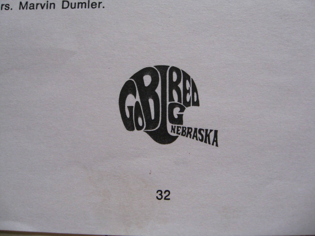
A nice capper to a great interview.
----------------------------------------
Scott here again!
Many thanks for making it through to the end of this interview!
All the best -
Scott
No comments:
Post a Comment
Thank you for taking the time to add a comment - all input is welcome, especially the constructive kind! All the best - Scott